Bokeh is an interactive Python library for visualizations that targets modern web browsers for presentation. Its goal is to provide elegant, concise construction of novel graphics in the style of D3.js, and to extend this capability with high-performance interactivity over very large or streaming datasets. Bokeh can help anyone who would like to quickly and easily create interactive plots, dashboards, and data applications.
- To get started using Bokeh to make your visualizations, see the User Guide.
- To see examples of how you might use Bokeh with your own data, check out the Gallery.
- A complete API reference of Bokeh is at Reference Guide.
The following notebook is intended to illustrate some of Bokeh’s interactive utilities and is based on a post originally done by my friend Sarah Bird, who is an incredible software engineer and a core developer for the Bokeh library. After seeing Sarah present her demo at PyData Carolinas 2016, I was excited to reimplement it for use in teaching my Visual Analytics students how to create interactive visualizations with Python. You can also find a Jupyter notebook version of this post in our course repo on GitHub.
Recreating Gapminder’s “The Health and Wealth of Nations”
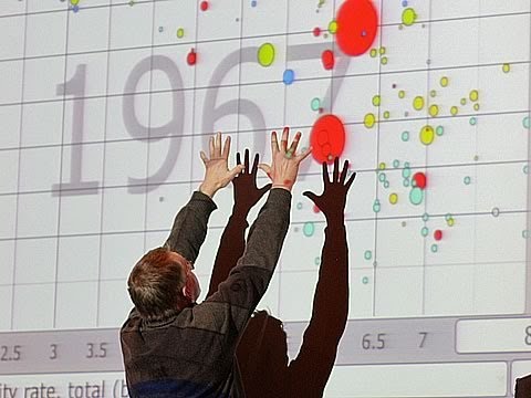
Gapminder started as a spin-off from Professor Hans Rosling’s teaching at the Karolinska Institute in Stockholm. Having encountered broad ignorance about the rapid health improvement in Asia, he wanted to measure that lack of awareness among students and professors. He presented the surprising results from his so-called “Chimpanzee Test” in his first TED-talk in 2006.
 ]
]
Rosling’s interactive “Health and Wealth of Nations” visualization has since become an iconic illustration of how our assumptions about ‘first world’ and ‘third world’ countries can betray us. Mike Bostock has recreated the visualization using D3.js, and it’s also be recreated using R with GoogleVis and even SAS. In this post, we will see that it is also possible to use Bokeh to recreate the interactive visualization in Python.
About Bokeh Widgets
Widgets are interactive controls that can be added to Bokeh applications to provide a front end user interface to a visualization. They can drive new computations, update plots, and connect to other programmatic functionality. When used with the Bokeh server, widgets can run arbitrary Python code, enabling complex applications. Widgets can also be used without the Bokeh server in standalone HTML documents through the browser’s Javascript runtime.
To use widgets, you must add them to your document and define their functionality. Widgets can be added directly to the document root or nested inside a layout. There are two ways to program a widget’s functionality:
- Use the CustomJS callback (see CustomJS for Widgets. This will work in standalone HTML documents.
- Use
bokeh serveto start the Bokeh server and set up event handlers with.on_change(or for some widgets,.on_click).
Imports
import numpy as np
import pandas as pd

from bokeh.layouts import layout
from bokeh.embed import file_html

from bokeh.io import show
from bokeh.io import output_notebook

from bokeh.models import Text
from bokeh.models import Plot
from bokeh.models import Slider
from bokeh.models import Circle
from bokeh.models import Range1d
from bokeh.models import CustomJS
from bokeh.models import HoverTool
from bokeh.models import LinearAxis
from bokeh.models import ColumnDataSource
from bokeh.models import SingleIntervalTicker

from bokeh.palettes import Spectral6
If you’re doing this in a Jupyter notebook, use the output_notebook() function from bokeh.io to display Bokeh plots inline. When show() is called, the plot will be displayed inline in the next notebook output cell. To save your Bokeh plots, you can use the output_file() function instead (or in addition).
Get the data
Some of Bokeh examples rely on sample data that is not included in the Bokeh GitHub repository or released packages, due to their size. Once Bokeh is installed, the sample data can be obtained by executing:
import bokeh.sampledata
bokeh.sampledata.download()
The location that the sample data is stored can be configured. By default, data is downloaded and stored to a directory $HOME/.bokeh/data, which is created if it does not already exist (e.g. $/Users/rebeccabilbro/.bokeh/data). It will take a couple minutes for the data to download.
Prepare the data
In order to create an interactive plot in Bokeh, we need to animate snapshots of the data over time from 1964 to 2013. In order to do this, we can think of each year as a separate static plot. We can then use a JavaScript Callback to change the data source that is driving the plot.
JavaScript Callbacks
Bokeh exposes various callbacks, which can be specified from Python, that trigger actions inside the browser’s JavaScript runtime. This kind of JavaScript callback can be used to add interesting interactions to Bokeh documents without the need to use a Bokeh server (but can also be used in conjuction with a Bokeh server). Custom callbacks can be set using a CustomJS object and passing it as the callback argument to a Widget object.
As the data we will be using today is not too big, we can pass all the datasets to the JavaScript at once and switch between them on the client side using a slider widget.
This means that we need to put all of the datasets together build a single data source for each year. First we will load each of the datasets with the process_data() function and do a bit of clean up:
def process_data():
    from bokeh.sampledata.gapminder import regions
    from bokeh.sampledata.gapminder import fertility
    from bokeh.sampledata.gapminder import population
    from bokeh.sampledata.gapminder import life_expect

    # Make the column names ints not strings for handling
    columns     = list(fertility.columns)
    years       = list(range(int(columns[0]), int(columns[-1])))
    rename_dict = dict(zip(columns, years))

    fertility   = fertility.rename(columns=rename_dict)
    life_expect = life_expect.rename(columns=rename_dict)
    population  = population.rename(columns=rename_dict)
    regions     = regions.rename(columns=rename_dict)

    # Turn population into bubble sizes.
    # Use min_size and factor to tweak.
    scaling  = 200
    pop_size = np.sqrt(population / np.pi) / scaling
    min_size = 3
    pop_size = pop_size.where(
                  pop_size >= min_size
                  ).fillna(min_size)

    # Use pandas categories and categorize & color the regions
    regions.Group = regions.Group.astype('category')
    regions_list  = list(regions.Group.cat.categories)

    def get_color(r):
        return Spectral6[regions_list.index(r.Group)]

    regions['region_color'] = regions.apply(get_color, axis=1)

    return (fertility, life_expect, pop_size,
        regions, years, regions_list)
Next we will add each of our sources to the sources dictionary, where each key is the name of the year (prefaced with an underscore) and each value is a dataframe with the aggregated values for that year.
Note that we needed the prefixing as JavaScript objects cannot begin with a number.
(fertility_df, life_expect_df,
pop_size_df, regions_df, years, regions) = process_data()

sources = {}

region_color      = regions_df['region_color']
region_color.name = 'region_color'

for year in years:
    fertility       = fertility_df[year]
    fertility.name  = 'fertility'
    life            = life_expect_df[year]
    life.name       = 'life'
    population      = pop_size_df[year]
    population.name = 'population'

    new_df = pd.concat(
                [fertility, life, population, region_color],
                axis=1
    )
    sources['_' + str(year)] = ColumnDataSource(new_df)
Later we will be able to pass this sources dictionary to the JavaScript Callback. In so doing, we will find that in our JavaScript we have objects named by year that refer to a corresponding ColumnDataSource.
We can also create a corresponding dict_of_sources object, where the keys are integers and the values are the references to our ColumnDataSources from above:
dict_of_sources = dict(zip(
                      [x for x in years],
                      ['_%s' % x for x in years])
                      )

js_source_array = str(dict_of_sources).replace("'", "")
Now we have an object that’s storing all of our ColumnDataSources, so that we can look them up.
Build the plot
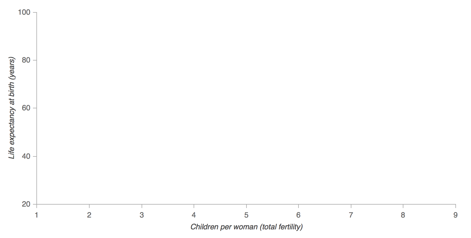
First we need to create a Plot object. We’ll start with a basic frame, only specifying things like plot height, width, and ranges for the axes.
xdr  = Range1d(1, 9)
ydr  = Range1d(20, 100)
plot = Plot(
    x_range=xdr,
    y_range=ydr,
    plot_width=800,
    plot_height=400,
    outline_line_color=None,
    toolbar_location=None,
    min_border=20,
)
If you were to call show() here, what would you expect to see? Bokeh’s API works in much the same way as Matplotlib’s, meaning that we can imagine our digital canvas in the same way we would imagine a traditional fabric canvas. As we add new elements to our plot object, we are adding new layers of information onto our canvas that will appear as overlays (unless they explicitly reset some earlier-set parameter). So far we have only created the plot object, so if we were to show() it at this phase, we would get… a blank canvas!
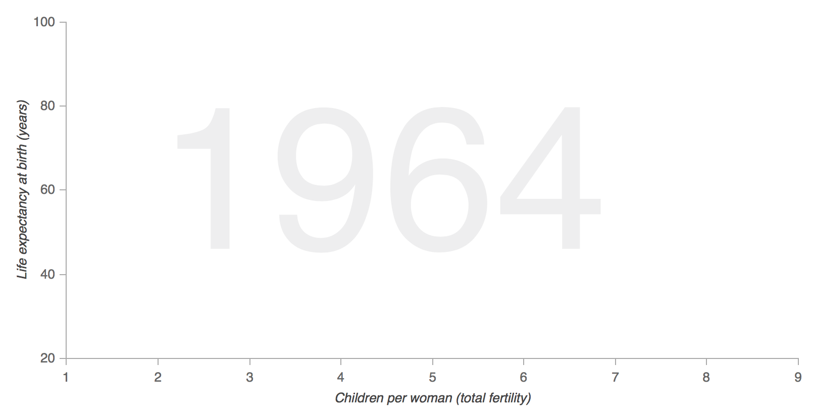
Build the axes
Next we can make some stylistic modifications to the plot axes (e.g. by specifying the text font, size, and color, and by adding labels), to make the plot look more like the one in Hans Rosling’s video.
AXIS_FORMATS = dict(
    minor_tick_in=None,
    minor_tick_out=None,
    major_tick_in=None,
    major_label_text_font_size="10pt",
    major_label_text_font_style="normal",
    axis_label_text_font_size="10pt",

    axis_line_color='#AAAAAA',
    major_tick_line_color='#AAAAAA',
    major_label_text_color='#666666',

    major_tick_line_cap="round",
    axis_line_cap="round",
    axis_line_width=1,
    major_tick_line_width=1,
)

xaxis = LinearAxis(
    ticker     = SingleIntervalTicker(interval=1),
    axis_label = "Children per woman (total fertility)",
    **AXIS_FORMATS
)
yaxis = LinearAxis(
    ticker     = SingleIntervalTicker(interval=20),
    axis_label = "Life expectancy at birth (years)",
    **AXIS_FORMATS
)

plot.add_layout(xaxis, 'below')
plot.add_layout(yaxis, 'left')
Now if we call show(), we’ll be able to see something — here’s what our plot looks like now that we’ve added the axes details:
Add the background year text
One of the features of Rosling’s animation is that the year appears as the text background of the plot. We will add this feature to our plot first so it will be layered below all the other glyphs.
text_source = ColumnDataSource({'year': ['%s' % years[0]]})
text        = Text(
                  x=2, y=35, text='year',
                  text_font_size='150pt',
                  text_color='#EEEEEE'
                  )
plot.add_glyph(text_source, text)
Recall that the API we are using will add elements incrementally, layer by layer, on top of each other until we are finished. That means that it’s quite important that we add the elements in the proper order so that we end up with a result that matches Rosling’s original. Here’s what our plot should look like so far:
Add the bubbles and hover
Next we will add the bubbles using Bokeh’s Circle glyph. We start from the first year of data, which is our source that drives the circles (the other sources will be used later).
# Add the circle
renderer_source = sources['_%s' % years[0]]
circle_glyph    = Circle(
                    x='fertility', y='life',
                    size='population', fill_alpha=0.8,
                    fill_color='region_color',
                    line_color='#7c7e71',
                    line_width=0.5, line_alpha=0.5
                    )

circle_renderer = plot.add_glyph(renderer_source, circle_glyph)
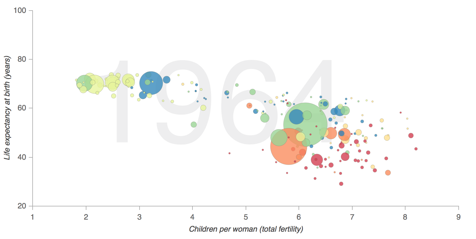
Here’s a static image of what our plot looks like once we’ve added the circle glyphs:
In the above, plot.add_glyph returns the renderer, which we can then pass to the HoverTool so that hover only happens for the bubbles on the page and not other glyph elements:
# Add hover for the circle (not other plot elements)
tooltips = "@index"
plot.add_tools(HoverTool(
                  tooltips=tooltips,
                  renderers=[circle_renderer]
                  )
              )
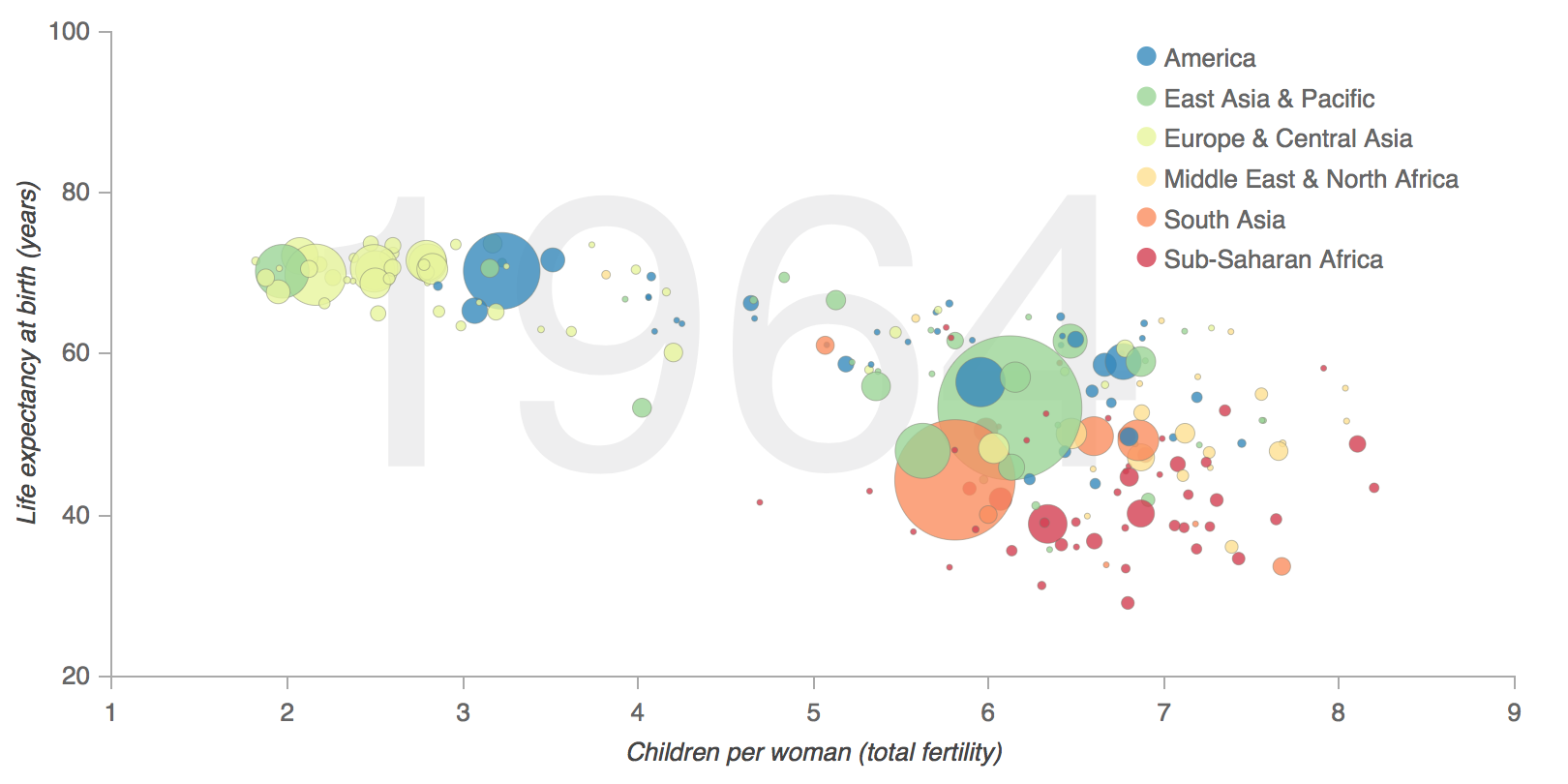
Add the legend
Next we will manually build a legend for our plot by adding circles and texts to the upper-righthand portion:
text_x = 7
text_y = 95
for i, region in enumerate(regions):
    plot.add_glyph(Text(
                      x=text_x, y=text_y,
                      text=[region],
                      text_font_size='10pt',
                      text_color='#666666'
                      )
                  )
    plot.add_glyph(Circle(
                      x=text_x - 0.1,
                      y=text_y + 2,
                      fill_color=Spectral6[i],
                      line_color=None,
                      fill_alpha=0.8,
                      size=10,
                      )
                  )
    text_y = text_y - 5
Once we’ve added our legend, our plot will look like this:
Add the slider and callback
Next we add the slider widget and the JavaScript callback code, which changes the data of the renderer_source (powering the bubbles / circles) and the data of the text_source (powering our background text). After we’ve set() the data we need to trigger() a change. slider, renderer_source, text_source are all available because we add them as args to Callback.
It is the combination of sources = %s % (js_source_array) in the JavaScript and Callback(args = sources...) that provides the ability to look-up, by year, the JavaScript version of our Python-made ColumnDataSource.
# Add the slider
code = """
    var year = slider.get('value'),
        sources = %s,
        new_source_data = sources[year].get('data');
    renderer_source.set('data', new_source_data);
    text_source.set('data', {'year': [String(year)]});
""" % js_source_array

callback = CustomJS(args=sources, code=code)
slider = Slider(
    start=years[0],
    end=years[-1],
    value=1,
    step=1,
    title="Year"
)
callback.args["renderer_source"] = renderer_source
callback.args["text_source"] = text_source
callback.args["slider"] = slider
slider.js_on_change("value", callback)
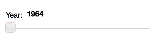
In order to see what our slider widget looks like by itself, we can call show(widgetbox(slider)):
Putting all the pieces together
Last but not least, we put the chart and the slider together in a layout, which we can display inline in a notebook by calling show(layout([[plot], [slider]], sizing_mode='scale_width')):
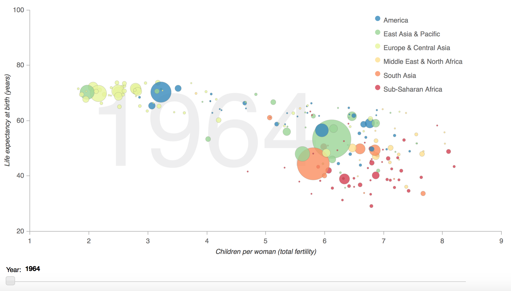
Looks pretty good!
For more on Bokeh see the User Guide, check out examples from the Gallery, and learn more about Bokeh’s API in the Reference Guide.